Understanding Flexbox: A Guide to CSS Flexible Box Layout

The CSS Flexible Box Layout (Flexbox) is a powerful tool for creating flexible and responsive layouts in CSS. Flexbox allows you to create complex layouts with ease, without the need for complex CSS rules or hacks. In this article, we'll take a closer look at Flexbox and how you can use it to create responsive web layouts.
What is Flexbox?
Flexbox is a CSS layout module that allows you to arrange elements in a flexible and responsive way. With Flexbox, you can define a container element and set the properties of the child elements within it. Flexbox allows you to control the alignment, spacing, and size of these child elements, creating a flexible and dynamic layout.
Basic Concepts of Flexbox
The Flexbox layout is based on two main concepts: flex containers and flex items.
Flex Containers
The flex container is the parent element that contains one or more child elements (flex items). To create a Flexbox layout, you need to define a flex container and set its properties. Here's an example:
.container {
            display: flex;
            flex-direction: row;
            }
In this example, we define a container element with the class "container". We set the "display" property to "flex", which tells the browser to treat this element as a Flexbox container. We also set the "flex-direction" property to "row", which defines the direction of the main axis of the Flexbox layout.

Flex Items
Flex items are the child elements within a Flexbox container. You can set the properties of these items to control their alignment, spacing, and size within the container. Here's an example:
.item {
        flex: 1;
        margin: 10px;
      }
In this example, we define a child element with the class "item". We set the "flex" property to "1", which tells the browser to distribute the available space equally among all the flex items. We also set the "margin" property to "10px", which creates spacing between the child elements.

Flexbox Properties
Flexbox provides a range of properties that you can use to control the layout of your Flexbox container and its child elements. Here are some of the most commonly used properties:
display: sets the display property of the container to "flex"
flex-direction: sets the direction of the main axis of the layout (row or column)
row(default): left to right inltr; right to left inrtlrow-reverse: right to left inltr; left to right inrtlcolumn: same asrowbut top to bottomcolumn-reverse: same asrow-reversebut bottom to top.container { flex-direction: row | row-reverse | column | column-reverse; }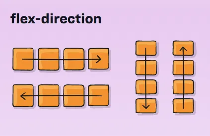
justify-content: controls the alignment of the flex items along the main axis
flex-start(default): items are packed toward the start of the flex-direction.flex-end: items are packed toward the end of the flex-direction.start: items are packed toward the start of thewriting-modedirection.end: items are packed toward the end of thewriting-modedirection.left: items are packed toward left edge of the container, unless that doesn’t make sense with theflex-direction, then it behaves likestart.right: items are packed toward right edge of the container, unless that doesn’t make sense with theflex-direction, then it behaves likeend.center: items are centered along the linespace-between: items are evenly distributed in the line; first item is on the start line, last item on the end linespace-around: items are evenly distributed in the line with equal space around them. Note that visually the spaces aren’t equal, since all the items have equal space on both sides. The first item will have one unit of space against the container edge, but two units of space between the next item because that next item has its own spacing that applies.space-evenly: items are distributed so that the spacing between any two items (and the space to the edges) is equal..container { justify-content: flex-start | flex-end | center | space-between | space-around | space-evenly | start | end | left | right ... + safe | unsafe; }
align-items: controls the alignment of the flex items along the cross axis
stretch(default): stretch to fill the container (still respect min-width/max-width)flex-start/start/self-start: items are placed at the start of the cross axis. The difference between these is subtle, and is about respecting theflex-directionrules or thewriting-moderules.flex-end/end/self-end: items are placed at the end of the cross axis. The difference again is subtle and is about respectingflex-directionrules vs.writing-moderules.center: items are centered in the cross-axisbaseline: items are aligned such as their baselines align.container { align-items: stretch | flex-start | flex-end | center | baseline | first baseline | last baseline | start | end | self-start | self-end + ... safe | unsafe; }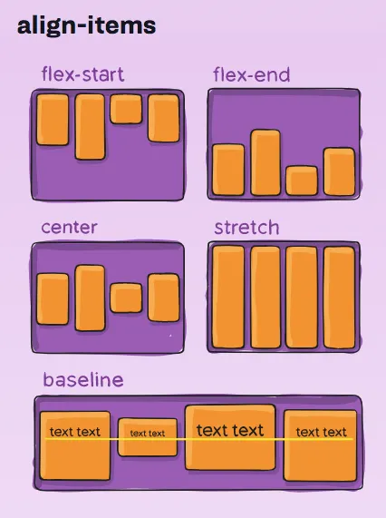
flex-wrap: controls whether flex items should wrap when the container is too small
nowrap(default): all flex items will be on one linewrap: flex items will wrap onto multiple lines, from top to bottom.wrap-reverse: flex items will wrap onto multiple lines from bottom to top..container { flex-wrap: nowrap | wrap | wrap-reverse; }
flex-grow: controls the amount of space that the flex item should take up

flex-shrink: controls the ability of the flex item to shrink when there is not enough space available
  .item {
    flex-shrink: 3; /* default 1 */
  }
flex-basis: sets the initial size of the flex item
  .item {
    flex-basis:  | auto; /* default auto */
  }
align-self: controls the alignment of a single flex item within the container
  .item {
    align-self: auto | flex-start | flex-end | center | baseline | stretch;
  }
Conclusion🎉
Flexbox is a powerful tool for creating flexible and responsive layouts in CSS. With Flexbox, you can easily create complex layouts that adapt to different screen sizes and devices. By understanding the basic concepts and properties of Flexbox, you can create more effective and visually appealing web pages. With Flexbox, the possibilities are endless, and you can create layouts that were once impossible to achieve with CSS.


