Mastering Responsive Design: A Beginner's Guide to Media Queries in CSS👨💻

In today's world🌍, where the number of mobile 📱users is on the rise, having a responsive website is no longer a luxury, but a necessity. With the ever-increasing variety of devices and screen sizes, it is essential to ensure that your website looks great✨ on all of them. Responsive design is the solution to this problem, and media queries in CSS are the building blocks of responsive design. If you are new to web development or just starting with responsive design, this beginner's guide will give you a comprehensive understanding of media queries in CSS. In this guide, we will cover the basics of media queries, how to use them to create responsive designs and best practices for implementing them. So, whether you are a web developer👩💻 or a designer, this guide will equip you with the knowledge and skills to create beautiful and responsive websites that look great on any device.
Understanding responsive design
Responsive design is a web design approach that aims to provide an optimal viewing 👀 and interaction experience across a wide range of devices, from desktop computers🖥️ to mobile phones.📱. The goal of responsive design is to ensure that your website adapts to different screen sizes, resolutions, and orientations. The primary benefit of responsive design is that it allows you to create a single website that works seamlessly across all devices, eliminating the need to create separate versions of your site for desktop and mobile users.
To achieve responsive design, you need to use a combination of CSS and HTML. CSS is a style sheet language used to style web documents, while HTML is a markup language used to create web pages. By using media queries in CSS, you can create responsive designs that adapt to different screen sizes and resolutions. Media queries are a powerful tool that allows you to apply different styles to your website based on the device's screen size or resolution. In the next section, we will cover the basics of media queries and how they work.
What are media queries?🤔
Media queries are CSS rules that apply different styles to a web page based on the device's characteristics, such as screen size, resolution, and orientation. Media queries are written in CSS and are used to target🎯 specific devices or device classes💻. For example, you can use media queries to target smartphones, tablets, and desktop computers.
Media queries work by testing the device's characteristics against a set of predefined conditions. If the device meets the conditions specified in the media query, the styles defined in the media query are applied. If the device does not meet the conditions specified in the media query, the default styles are applied.
How media queries work⚒️
Media queries work⚙️ by using the @media rule in CSS. The @media rule is used to define a set of styles that should be applied to a web page based on the device's characteristics. The @media rule is followed by a set of conditions that must be met for the styles to be applied. The conditions are defined using media features.
Media features are predefined characteristics that can be tested using media queries. Some of the most common media features include min-width, max-width, orientation, and resolution. The min-width and max-width media features are used to test the device's screen size, while the orientation media feature is used to test the device's orientation (portrait or landscape). The resolution media feature is used to test the device's screen resolution.
Syntax of media queries🤔
The syntax of media queries is relatively simple. To create a media query, you start with the @media rule, followed by the media feature and the condition. Here's an example:
@media (min-width: 768px) {
 /* Styles for devices with a minimum width of 768px */
}
In this example, we are using the min-width media feature to target devices with a minimum width of 768 pixels. Any styles defined within the curly braces will be applied to devices that meet this condition.
You can also specify multiple media features and conditions in a single media query. Here's an example:
@media (min-width: 768px) and (max-width: 1024px) {
/* Styles for devices with a minimum width of 768px and a maximum width of 1024px */
}
In this example, we are using both the min-width and max-width media features to target devices with a minimum width of 768 pixels and a maximum width of 1024 pixels.
Types of media queries
There are two types of media queries: and and only. The and media query is the most common and is used to apply styles to devices that meet multiple conditions. The only media query is used to apply styles to devices.📱 that match a specific condition and nothing else. Here's an example of an only media query:
@media only screen and (max-width: 768px) {
/* Styles for devices with a maximum width of 768px */
}
In this example, we are using the only keyword to ensure that the styles are only applied to devices with a maximum width of 768 pixels and nothing else.
Creating responsive layouts with media queries⚒️
Now that you understand the basics of media queries, it's time to start creating responsive layouts. The first step in creating a responsive layout is to define the layout for the smallest screen size. This layout will serve as the foundation for the rest of the layout. Once you have defined the layout for the smallest screen size, you can use media queries to apply additional styles to larger screens.
Here's an example of how you can use media queries to create a responsive layout:
/* Default styles for all screen sizes */
.container {
    display: flex;
    flex-wrap: wrap;
}

/* Styles for screens with a minimum width of 768px */
@media (min-width: 768px) {
    .container {
        justify-content: space-between;
        }
}

/* Styles for screens with a minimum width of 1024px */
@media (min-width: 1024px) {
    .container {
        justify-content: center;
        }
}
In this example, we are using media queries to apply additional styles to screens with a minimum width of 768 pixels and 1024 pixels. The container class is set to display: flex; for all screen sizes, but the justify-content property is set to space-between for screens with a minimum width of 768 pixels and center for screens with a minimum width of 1024 pixels. This creates a responsive layout that adapts to different screen sizes.
Testing media queries
Now that you have created your responsive layout, it's essential to test it on different devices to ensure that it works as intended. There are several tools you can use to test your media queries. One of the most popular tools is the Chrome DevTools. The Chrome DevTools allow you to simulate different devices and screen sizes, making it easy to test your responsive design.
To test your media queries using the Chrome DevTools, follow these steps:
Open your website in Google Chrome.
Press
F12to open the Chrome DevTools.
Click on the
Toggle device toolbaricon in the top-left corner of the DevTools.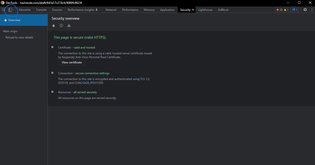
Select the device you want to simulate from the dropdown menu.

Test your website to ensure that it looks and works as intended.
Common mistakes to avoid in media query implementation
While media queries are a powerful tool for creating responsive designs, there are some common mistakes that you should avoid. Here are some of the most common mistakes to avoid:
Not starting with a mobile-first approach. It's essential to start with a layout for the smallest screen size and then use media queries to apply additional styles to larger screens.
Overcomplicating your media queries. It's essential to keep your media queries simple and easy to maintain. Avoid using too many media features and conditions in a single media query.
Not testing your media queries on different devices. It's essential to test your media queries on different devices to ensure that they work as intended.
Resources for mastering responsive design with media queries
If you want to learn more about responsive design and media queries, there are several resources available online. Here are some of the best resources for mastering responsive design with media queries:
CSS-Tricks – A comprehensive guide to media queries for standard devices.
MDN Web Docs – A guide to using media queries in CSS.
Responsive Web Design Basics – A guide to responsive web design from Google.
Conclusion🥳
In today's world🌍, where the number of mobile users is on the rise📈, having a responsive website is no longer a luxury, but a necessity. With the ever-increasing variety of devices and screen sizes, it is essential to ensure that your website looks great ✨on all of them. Responsive design is the solution to this problem, and media queries in CSS are the building blocks 🧱 of responsive design.
In this guide, we have covered the basics of media queries, how to use them to create responsive designs and best practices for implementing them. We have also discussed common mistakes to avoid and provided resources for mastering responsive design with media queries.
By following the tips and techniques outlined in this guide, you can create beautiful and responsive websites that look great on any device🖥️. So, whether you are a web developer or a designer, it's time to start mastering responsive design with media queries.


